Background
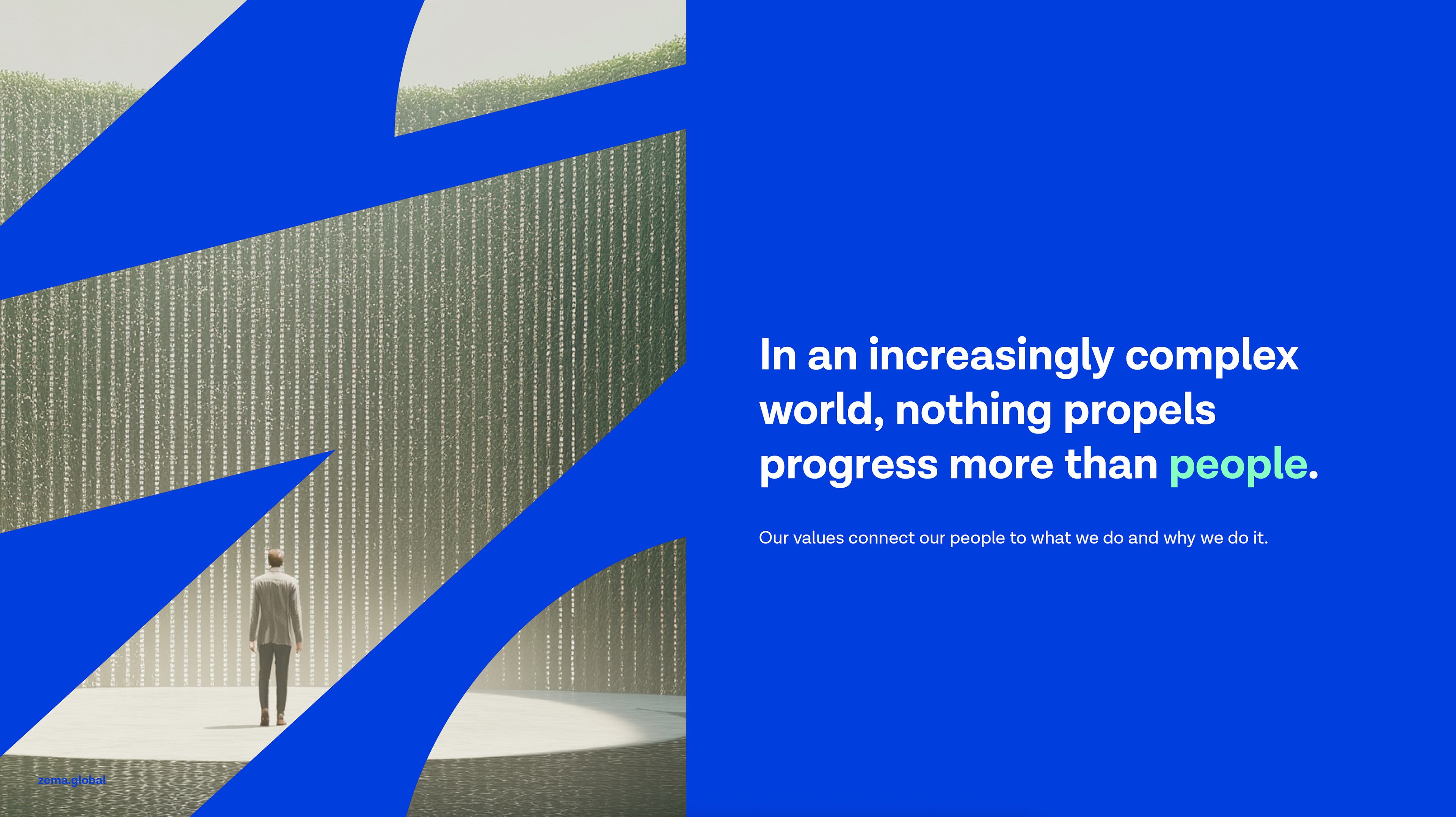
ZEMA, a trusted platform in energy and commodity data, needed a bold repositioning. After its acquisition by Morningstar, the challenge was clear: modernize its image, and communicate a new, human-centered vision of data.
Identity
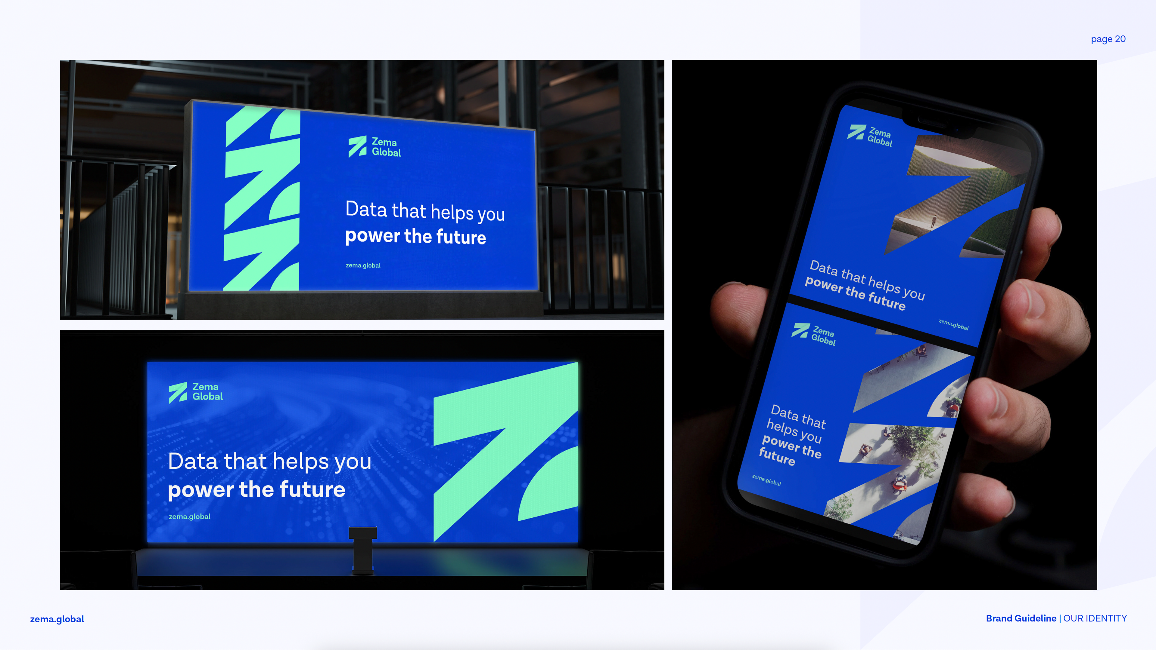
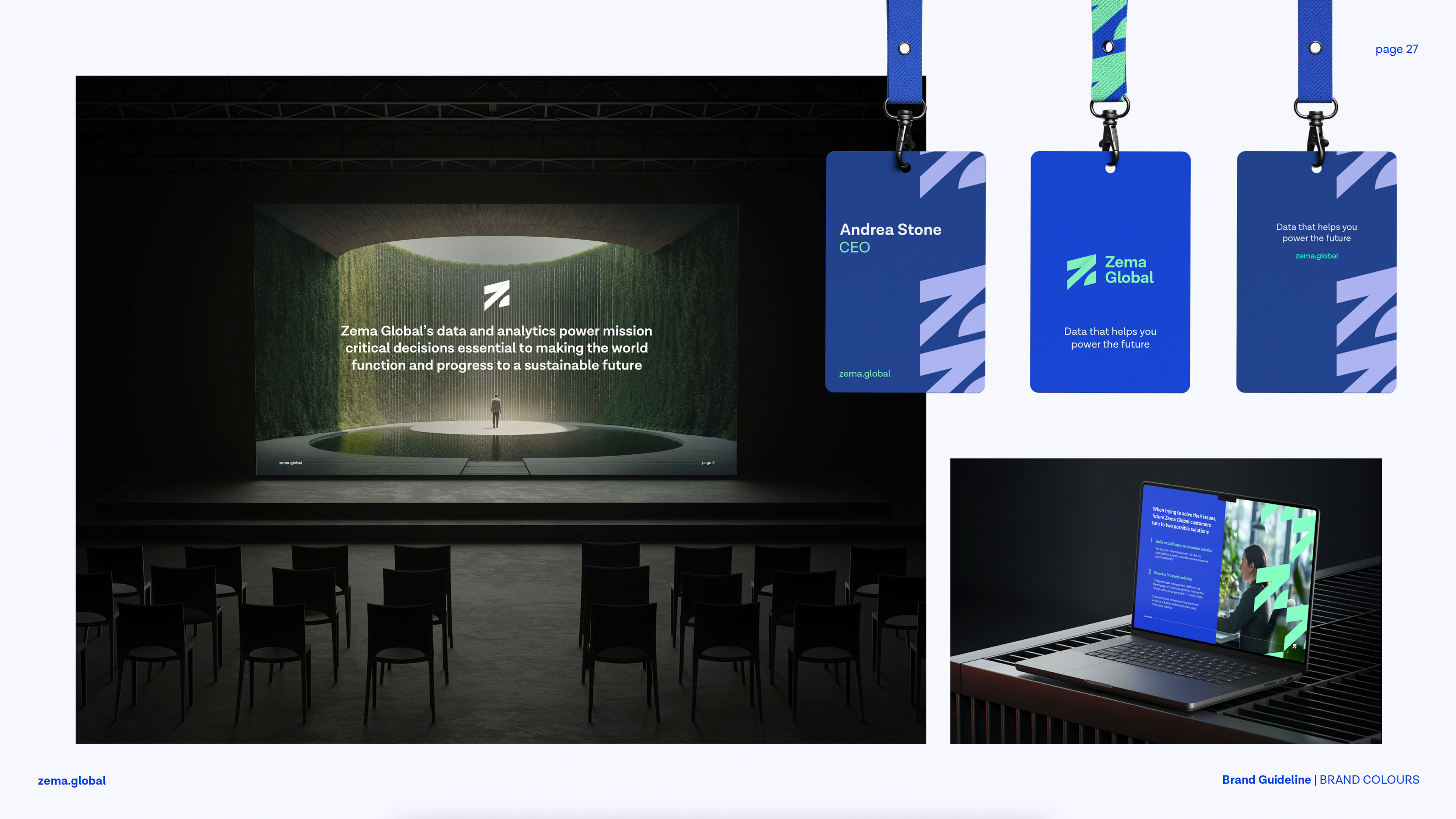
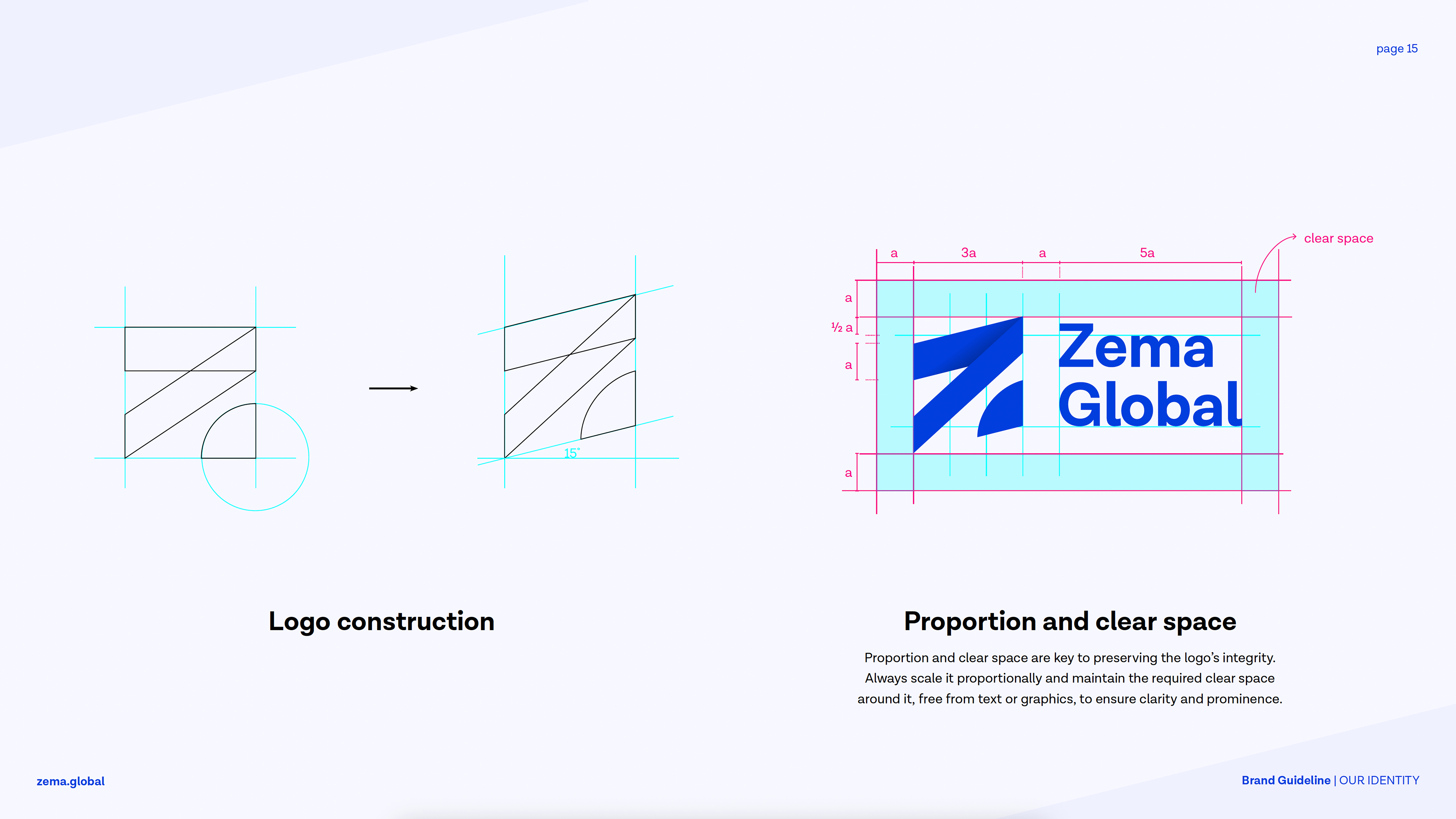
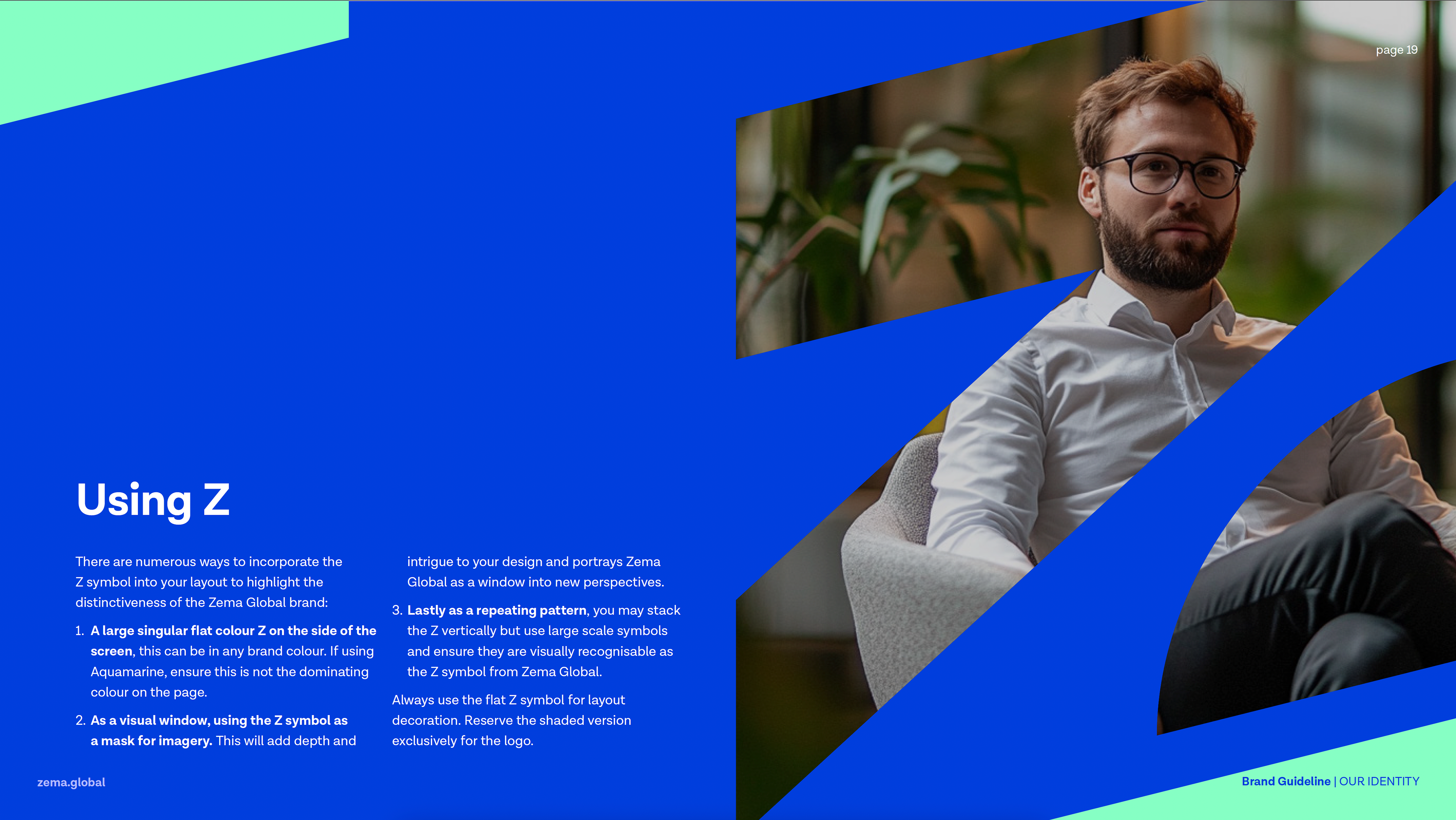
The Zema Global logo centers around a bold, angular “Z” that symbolizes movement, momentum, and clarity. Its upward-slanting geometry suggests forward direction and progress, while the open lower section evokes an oasis — a visual metaphor for clarity in the complexity of data. Designed to stand confidently on its own or function as a graphic device across layouts, the symbol captures Zema’s role as both a guide and a grounding presence in the evolving data landscape.


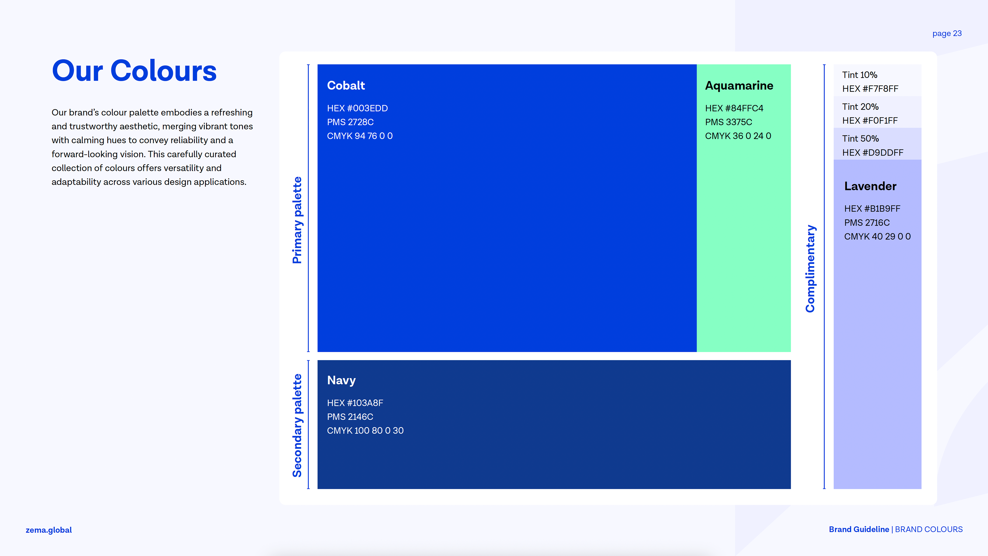
Brand colours
The color palette balances trust and vibrancy to reflect Zema’s dual identity as both dependable and forward-thinking. Cobalt serves as the anchor — strong, stable, and authoritative — while Aquamarine adds energy and optimism as an accent. Lavender and its tints introduce warmth and softness, helping humanize the brand in a highly technical space. Together, the palette is designed for clarity, contrast, and emotional resonance across a range of applications.
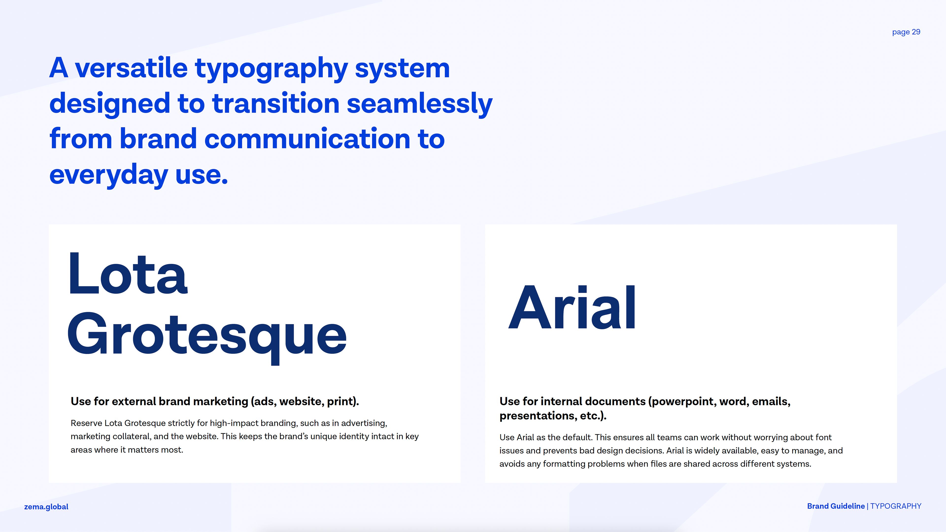
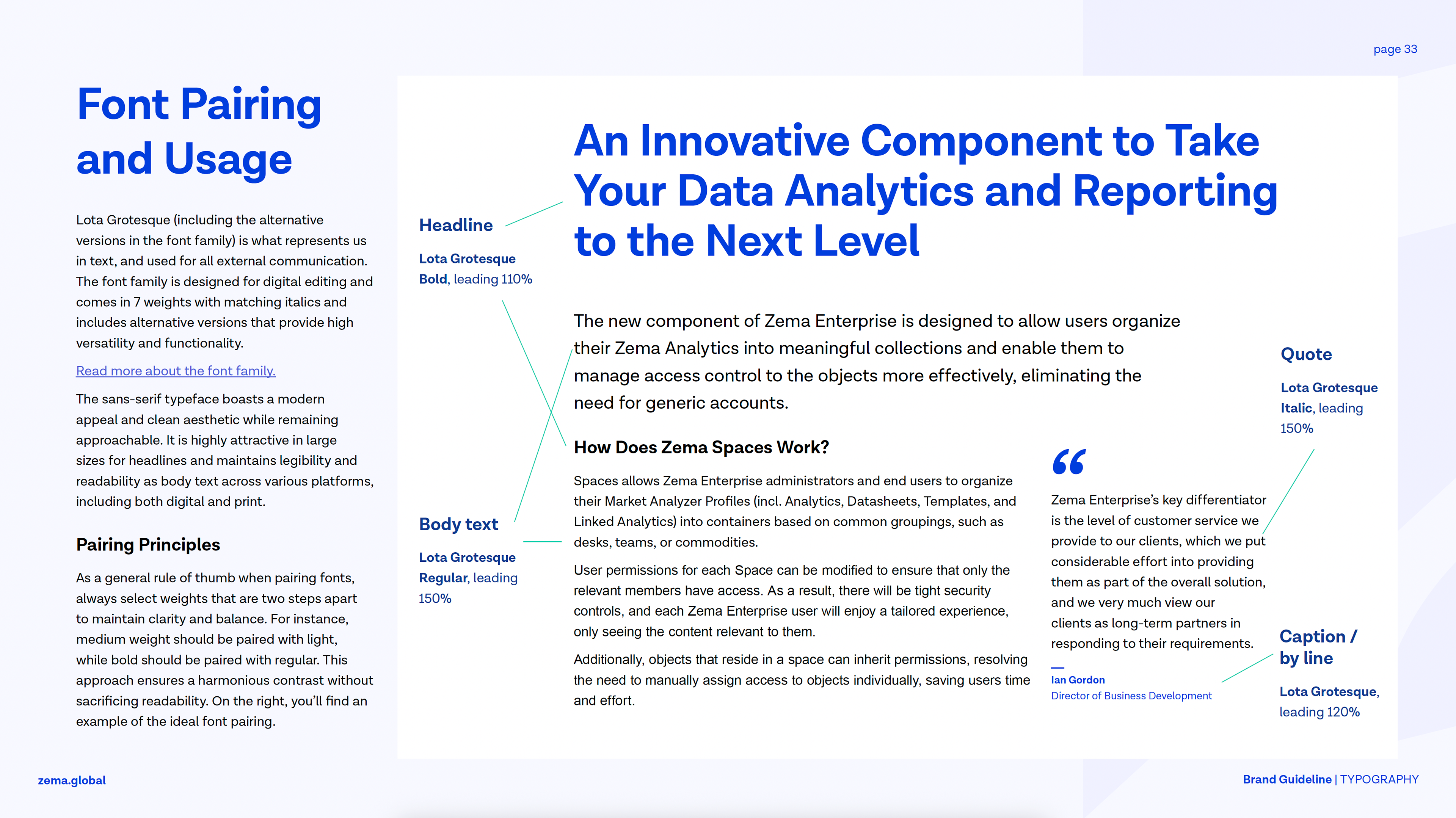
Typography
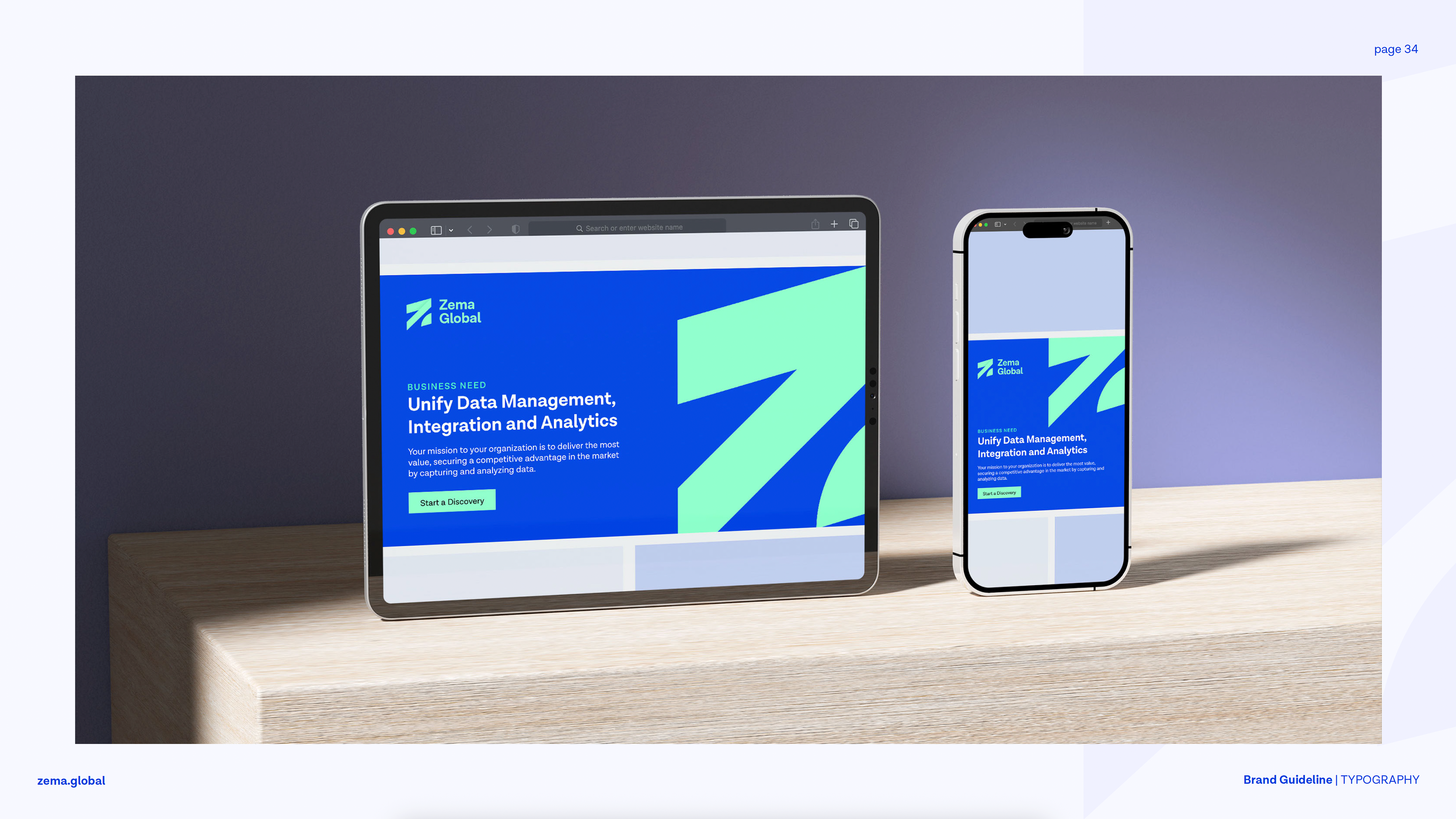
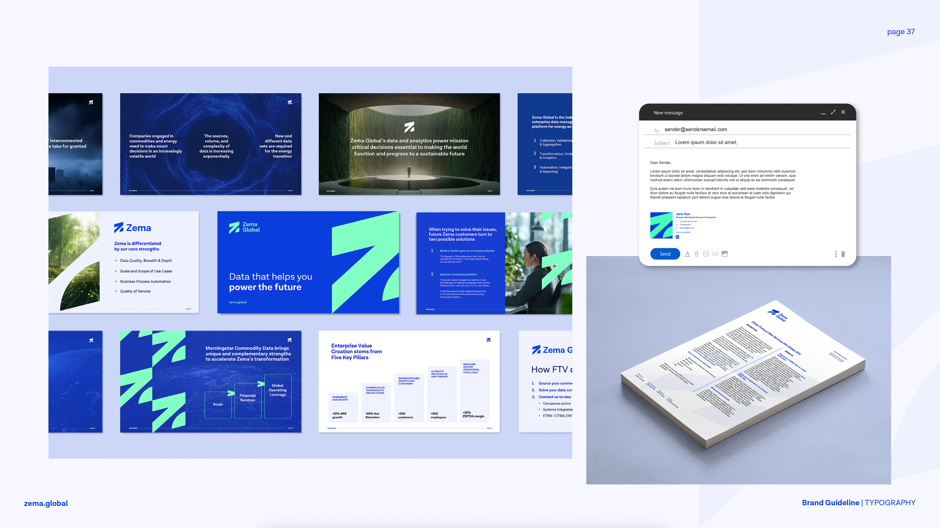
The typography system pairs Lota Grotesque for external branding with Arial for internal use, striking a balance between distinctive personality and everyday practicality. Lota Grotesque’s modern, clean lines convey clarity and professionalism, while its range of weights supports strong visual hierarchy. Arial ensures consistency and accessibility across internal documents, making the system both expressive and functional.
Imagery

Application