Hystar’s drive for quality starts with using the best organic soil-growing methods to grow their own flower. Where other live resin extractors flash-freeze their material for processing, Hystar makes their extracts purely from wet, raw, freshly-picked flower—something we hadn’t seen anyone else do. Additionally, their proprietary extraction system leaves no detectable trace of solvents in the finished product.
Utilizing quality ingredients and innovative manufacturing, their concentrates retain the flavour of the flower’s full terpene profile. The taste is full-bodied with the purest balance of terpenes and cannabinoids reflective of the original flower. These unique factors produce a remarkable user experience—one we aimed to distinguish from the rest of the market as we developed their brand strategy.
Brand Opportunity
We envisioned Hystar at the forefront of the artisanal craft cannabis market. We knew that cannabis connoisseurs and aficionados actively seek an exceptional user experience. While other extracts in the pre-legalization era commonly use stereotypical branding, Hystar’s product commands sophistication and class. We resolved to design a brand image, voice, and packaging that reflected the level of craft and commitment the Hystar team puts into their product.
To elevate their brand image to its own class, we developed specific brand language. We named the product “raw resin” instead of the market-established “live resin” to reflect the unique extraction process. We chose “true full spectrum extract” to describe how their innovative process preserves the flower’s full flavour and terpene profile which are often lost in other products. Establishing specific, purposeful language allows Hystar to highlight product elements exclusive to the brand that excite the cannabis connoisseur’s palate. We designed a beautiful, informative website to educate consumers on the new product category of raw extracts as well as coordinated and continuously manage all marketing efforts digital and otherwise.
Strategy + Execution
Hystar’s new brand identity is sophisticated and luxurious. Having full creative freedom, we used our narrative of the connoisseur experience to produce rich imagery and video assets, unlike any other brand. Honouring original live resins like hash and charas, we found inspiration in Arabic calligraphy and middle eastern design concepts for choosing the logo font. As fans of balance and aesthetics, we saw the beauty and complexity of the golden cannabinoid ratio and its reflection in the value and novelty of the product itself. Connoisseurs would truly love this!
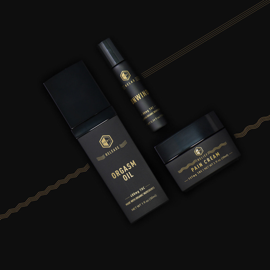
We designed the product packaging to be as much of a multi-sensory experience as the product inside. Our carefully selected textured paper stock adds a strong tactile impression in the hands of the consumer. The gold-stamped print shimmers in the light, just like the resin itself. The die-cut window allows consumers to easily see the product and be wowed. Where typical extract packaging comes in sealed envelopes or simple unbranded containers, the window instantly draws the eye to the beauty of the product. Every small detail was designed to reflect the complex and refined values of the extract itself.
Photography: Matt Sommerville
